
9 Worst Fonts of All Time
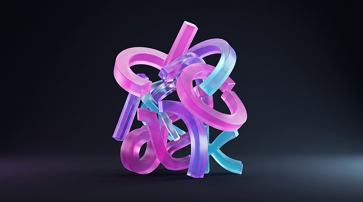
Here it is: the most important article of the year.
Fonts play a pivotal role in written communication. Do not believe it? Imagine visiting an accountancy website written entirely in Jokerman. Something would tell you that they might not be the best qualified people to talk about tax returns.
If your website copy, or any other marketing material for that matter, uses any of the fonts below, consider this article a cease and desist.
The nine fonts, in order
1. Jokerman
Nothing says "I have just discovered the font selection tab" like Jokerman.
Created in 1995 by the British designer Andrew K. Smith, Jokerman is the go-to font for school projects and for anyone who wrongly associates it with words such as fun, fanciful and light-hearted.
Whether you are a stand-up comic, a children's entertainer or an actual medieval joker, do not use Jokerman. If you want to ruin your credibility entirely, by all means get amongst it.
2. Papyrus
Once again, a firm favourite with school-aged children. If your homework is to write a 100-word story on the life of an ancient Egyptian, this is the one excuse to use Papyrus.
If you are over the age of 10, however, it is not socially acceptable to use this atrocity of a font.
Even if you are an archaeologist who specialises in the ancient Egyptians, do not use Papyrus. You of all people should know that they wrote in hieroglyphs.
3. Webdings
There is no rhyme or reason to Webdings. I do not understand it and I do not know why it was created. We will also lump Wingdings in here while we are at it.
Let us move swiftly on.
4. Comic Sans
Comic Sans is a lot subtler in its degradation than the fonts above it, and it is still truly awful. It says something about the world we occupy that Comic Sans is not even the worst font on this list.
It was drawn by Vincent Connare, a former Microsoft font designer, in the mid-1990s, and it has survived every attempt to retire it since.
It is neither cutesy nor comical. Please make it go away.
5. Times New Roman
"I have gone to the bother of writing words on a page. What more do readers want?"
You have given up. You do not care any more. You do not have a creative bone in your body and you do not care who knows it. Want to live in a world without puppies and rainbows? Choose Times New Roman.
Just like the once mighty Roman Empire, Times New Roman was doomed to be usurped by a new bunch of upstarts. In its day it was unchallenged, the measure by which other fonts were created. Fast forward to today and all that is left is a distant memory of when it was the epitome of civilisation.
6. Courier
"All this digital technology and the proliferation of computer screens is making me dream of simpler times. Oh, I know: I will pretend I am writing on a typewriter."
While you are at it, fetch your quill and a bowl of leeches. Some things should stay in the past, and the typewriter is one of them. We all know what a typewriter is. You do not have to give your reader a history lesson.
7. Curlz MT
I struggle to find an appropriate place to use this nightmarish font. Curlz MT screams of clownish night terrors and a level of eccentricity that belongs in a circus, not on a website.
Curly fonts are not cool. Like Webdings and Wingdings, Curlz MT seems to have forgotten that words were meant to be read.
8. Blackadder ITC
Unfortunately, Blackadder ITC does not exude the same comedic intelligence as the television programme it was named after.
As mentioned above, curly fonts are not cool. They are illegible, and they give people motion sickness.
9. Bradley Hand
Why do people try to pretend the text they have typed was handwritten, in the most scrawly, weak and feeble way possible?
You are fooling nobody. Handwritten fonts drive your readership mad, and worst of all they become entirely illegible when they are set small or meant to be read from a distance, on a poster or a billboard.
So there we have it: the 9 Worst Fonts of All Time. Choose any one of them for your website or your marketing material at your peril.
So what fonts should you choose?
Fonts that are readable, clear, stylish and unique are sure winners. There is no silver bullet in the font world, though.
Typefaces such as Helvetica and Calibri are already sitting on most computers, and designers use them constantly for good reason. Others, including New Baskerville, DIN 1451 and HTF Didot, are not simply waiting there to be used: the versions a designer reaches for are licensed, so check the terms and the cost before you build a brand on one.
If your current website features any of the nine above, you could be in serious danger of scaring away potential customers. Outdated typefaces also suggest that your website could be in serious need of an update.
If you would like help choosing typefaces for a brand, our Brand & Creative work covers identity, typography and the decisions behind them. You can also talk to us about your website if a font from this list is currently doing you harm.
Our expertise
How we can help with this
Related articles
Keep reading
Brand & Creative
What Do Your Logo Files Mean?
Your new logo has arrived in several different files. Here is what each format is for, and when to use it.
Brand & Creative
What Your Colour Scheme Says About Your Business
Colour is one of the fastest ways a business communicates. Here is how the main colours tend to be read, and where colour fits into your branding.
Discuss Your Project
Let's build something that stands apart
Tell us what you are trying to achieve and we will come back to you with a considered response.